Role: Creative Direction · Graphic Design · Web Design · Print Production
Deliverables: Wedding Invitation · Wedding Website · Ceremony Brochure
Tools: Adobe Creative Cloud · Figma · Web Design Platform
I created a cohesive visual identity for a Tamil Hindu wedding across invitation, website, and ceremony brochure. The design combined the couple’s love of purple and floral elements with gold accents, while making the cultural aspects of the ceremony approachable for all guests. who were unfamiliar with Tamil Hindu wedding traditions.
I began by translating the couple's preferences, venue, and cultural context into a cohesive visual direction.
The wedding was held in a greenhouse setting, which inspired the use of floral elements and a softer, botanical aesthetic. Purple became the primary colour, reflecting the bride's preference, while gold was introduced as an accent to complement the traditional gold jewellery worn during the wedding.
Some of the additional colours are sub accents or colours that naturaly appear at the venue. This was to visualize how the colours
From this direction, I established:
A purple and gold colour palette
Complementary typography
Floral and botanical graphic elements
An elegant, celebratory visual style
A consistent system that could translate across print and digital
Goal: Create a visual identity that felt personal to the couple while remaining appropriate to the cultural and ceremonial setting.

I explored several invitation concepts based on their preferences before presenting options to the couple. After they selected a direction, I refined the design and prepared the artwork for professional print production.
Because gold was an important part of the visual identity, I designed separate production layers for gold foil stamping and blind debossing.
This required considering not only how the invitation looked on screen, but how each design element would translate physically through the printing process.
Process:
Concepts → Client Selection → Refinement → Production Artwork → Proofing → Print
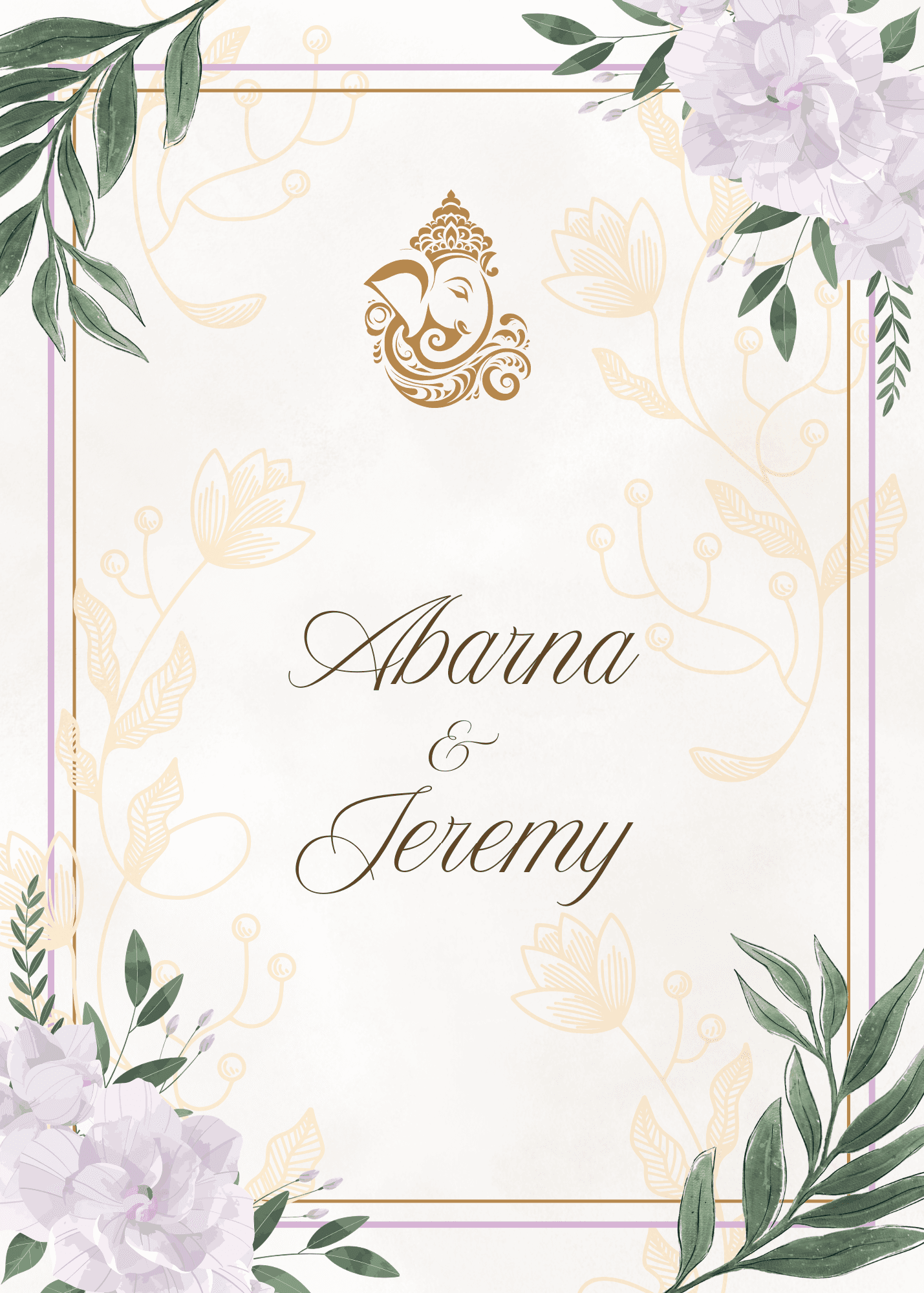


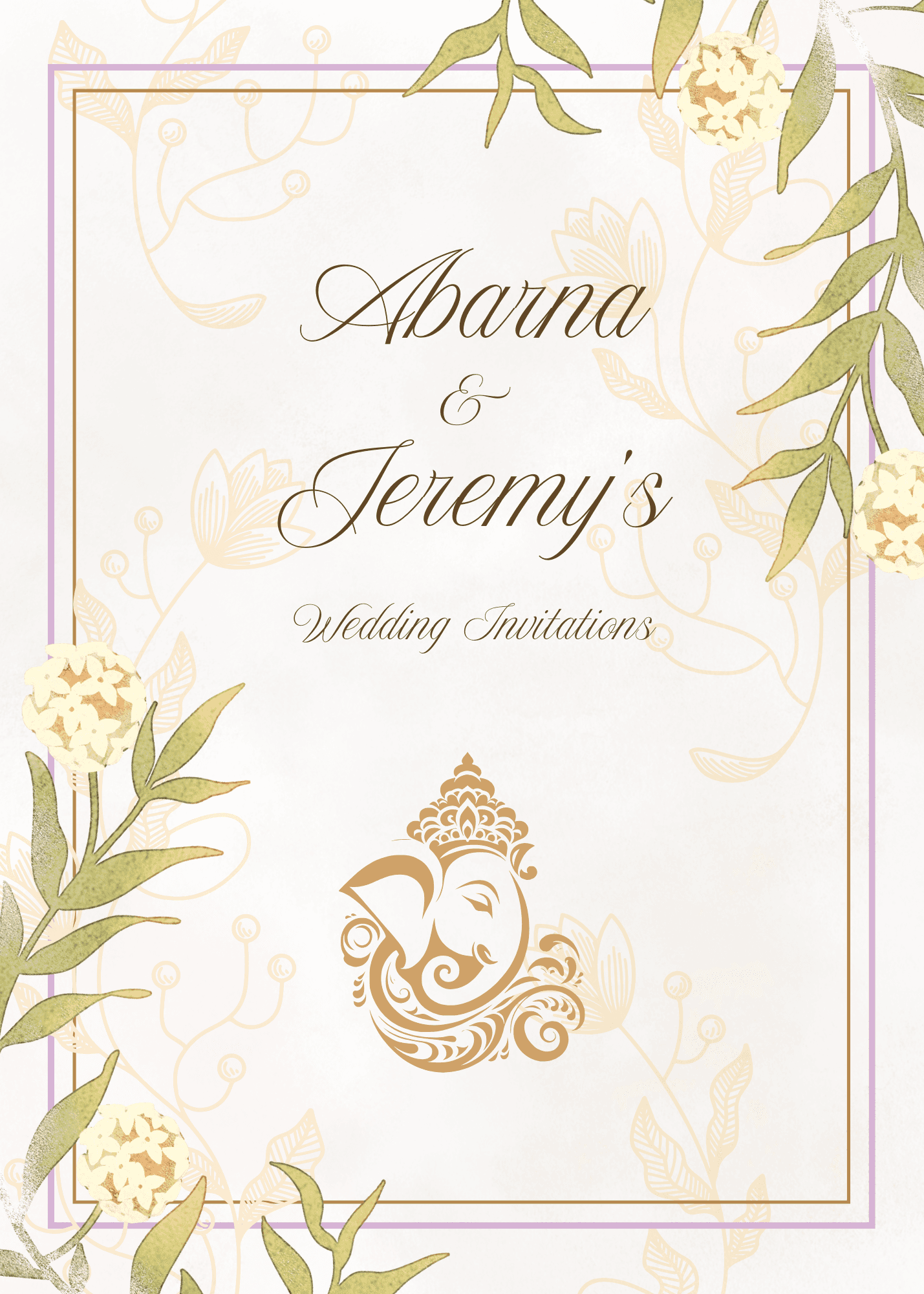


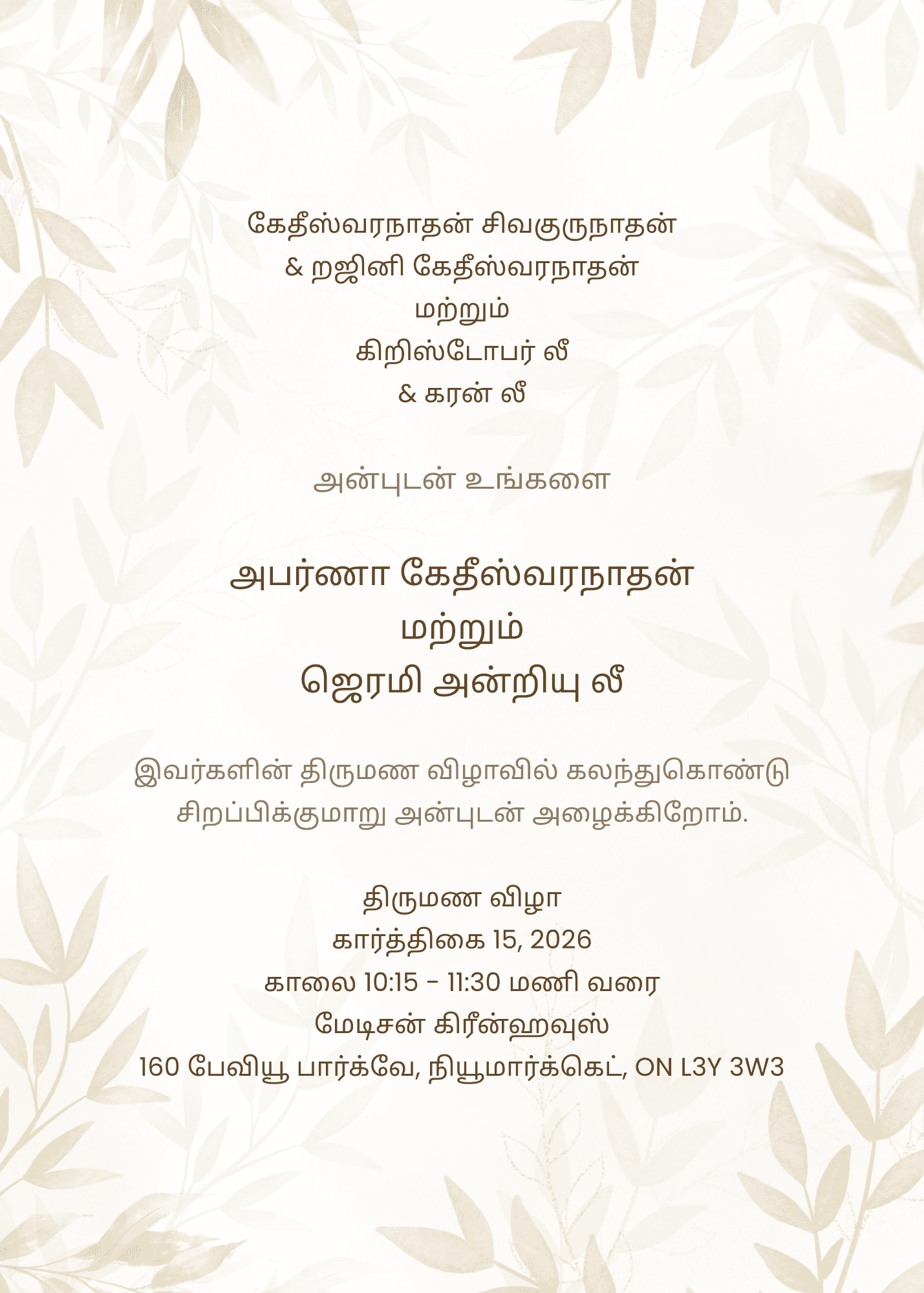

CMYK Print

Foil Layer

Deboss Layer

Note this is a demo and not the final. The final product will be photographed soon.
From concept to production
I explored several invitation concepts before presenting options to the couple. After they selected a direction, I refined the design and prepared the artwork for professional print production.
Because gold was an important part of the visual identity, I designed separate production layers for gold foil stamping and blind debossing.
This required considering not only how the invitation looked on screen, but how each design element would translate physically through the printing process.
Process
Concepts → Client Selection → Refinement → Production Artwork → Proofing → Print

The wedding was a long Tamil Hindu ceremony, and not every guest attending was familiar with the traditions, rituals, or meaning behind the events.
Rather than creating a brochure that simply listed the ceremony schedule, I designed it as a guest-friendly introduction to the ceremony itself.
The brochure explained the key events and provided historical and cultural context, helping guests understand what they were experiencing as the ceremony progressed.
I carried the established visual system into the brochure through the same purple and gold palette, typography, and decorative elements.
Design challenge
How do you make a culturally significant ceremony understandable to guests who may have no prior knowledge of it?
My solution was to combine information design with visual storytelling, creating something that was informative without feeling overly academic or disconnected from the celebration.

Each deliverable served a different purpose, but they were designed as parts of the same visual system.
INVITATION
Introduced the visual identity and set the tone.
WEBSITE
Extended the experience digitally and provided practical information.
BROCHURE
Helped guests understand and engage with the ceremony.
The result was a connected experience across physical, digital, and informational touchpoints.
Creative Direction
Translated the couple's preferences, venue, and cultural context into a unified visual language.
Graphic Design
Developed concepts and refined the selected direction across multiple print applications.
Production Design
Prepared specialized artwork for foil stamping and blind debossing and worked through the print production process.
Web Design
Customized a wedding website within a defined budget while maintaining the established visual identity.
Information Design
Turned complex cultural and historical information into an approachable guest resource.
Client Collaboration
Presented concepts, incorporated feedback, and onboarded the couple to manage their digital experience.
Problem Solving
Balanced creative goals, cultural considerations, technical requirements, and budget constraints throughout the project.
Final Invitations